|
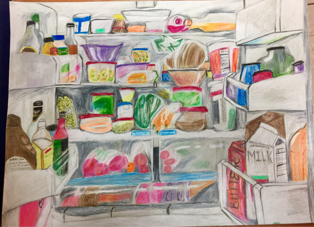
The craftsmanship in my drawing is mostly neat. I believe I could have done a better job with the space behind all the containers, instead of coloring it mostly grey. One aspect I like in my drawing is that there is a lot of detail and a lot to look at. Since my drawing is the inside of the refrigerator, I believe it is unified since my subject covers the whole paper. I am proud of how my shapes turned out especially the fridge doors on the right and left. Those took the most time! From the picture I took, I had to change some of the colors in my drawing to make the piece more interesting. Most of the colors, however, are taken directly from the image. My drawing has a lot of color. Since I used prismacolor, I was using the white color pencil a lot. I used it to blend different colors together and also lighten up other colors such as the orange and pomegranate juice in the top right. White and grey are used heavily in my drawing. I decided to darken up the bottom of the refrigerator because it gives the appearance of more items in the fridge (at the back). Since there was already so much white and grey in my drawing, I used black for shadows and in the first row. I also used more neon colors so that they would pop more against the grey paper. I created contrast in my piece through all the color and highlights. I used a lot of highlights in my drawing to show that objects were bottles or containers. While drawing, I put the highlights in specific places to achieve a realistic effect. Since the theme of this project was opacity, highlights were very important. I used the white and black prismacolor pencil on each object in my drawing to keep from making it look flat. I think I definitely could still improve with some of the highlights in the middle portion of my drawing. I feel like I could improve on the texture in my drawing because I wasn’t as focused on creating texture as I was with opacity.
I don’t exactly have a background. My subject, which is my fridge, fills up the entire piece. This makes it more interesting to look at, but also has a cohesive feeling. I like that my drawing fills the whole page; I was able to capture the whole inside of the refrigerator. I noticed a pattern in my drawings- I tend to focus more on the macro-or big picture. My last prismacolor drawing was of the Hunt library. Next time, I would like to challenge myself and focus more on one object and get all the details in that object. I am glad I had a lot of practice with prismacolor before this drawing. That is one of the reasons I decided to use prismacolor instead of pastel chalk. Another reason was that there are a lot of small details in my drawing, therefore either the chalk pastels or chalk pencils would be too large to draw the smaller details. I actually liked the pastels because the blend really easily. I was very proud of my smarties drawing and believe that I did a good job with the pastels, but I wanted to use prisma to keep improving my technique. Time was a problem for me as well as layering with the color pencil. The biggest difficulty I faced was getting the whites even whiter in my drawing. One of the things I'm not satisfied with in my drawing is how the white color pencil came off as a muted white on the grey paper. Maybe if I had chosen a darker colored paper, the white would have popped out more. I also had difficulty drawing light in my piece. There is a light source at the top of my drawing and I feel like it does not truly look like a refrigerator light, and just looks like a box. Another aspect I could improve on would be incorporating more, maybe unusual colors, into my drawing. This might make the piece feel more complete. 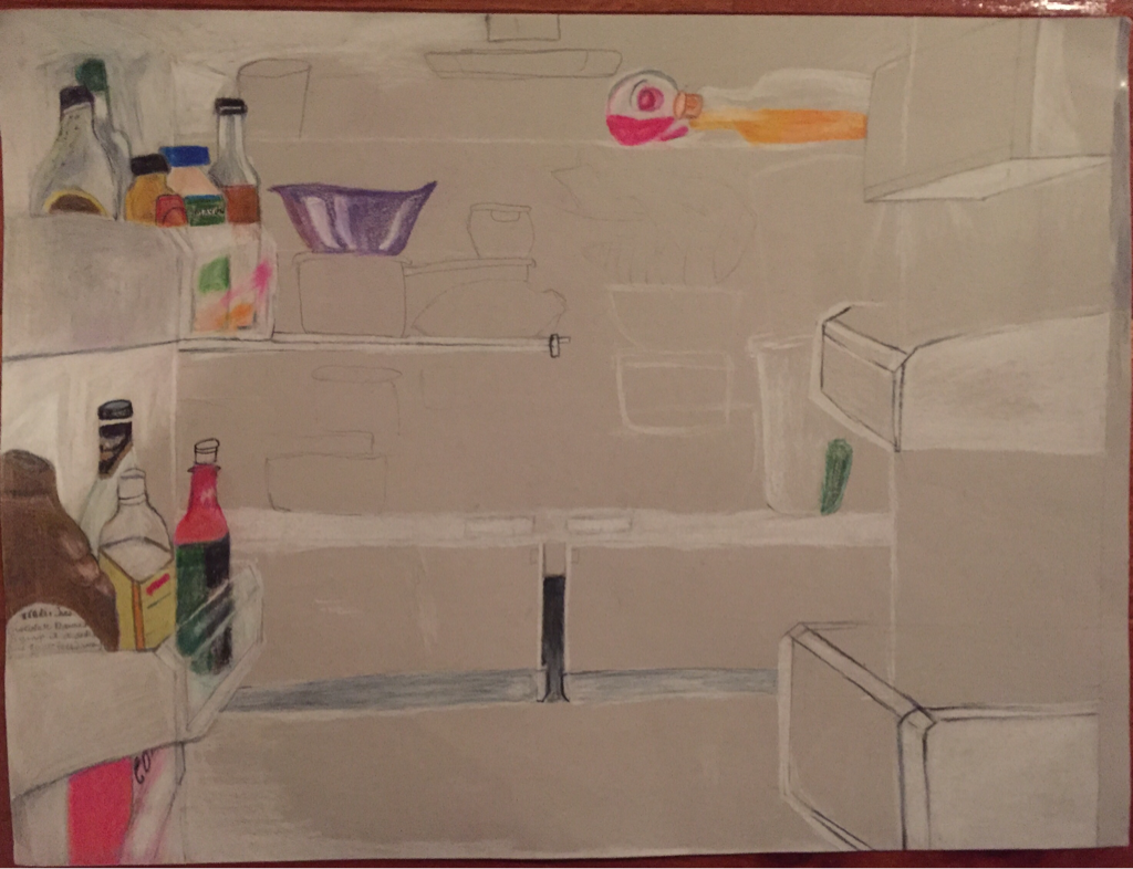 This is my opacity drawing (so far). It's taking a long time because of all the details.
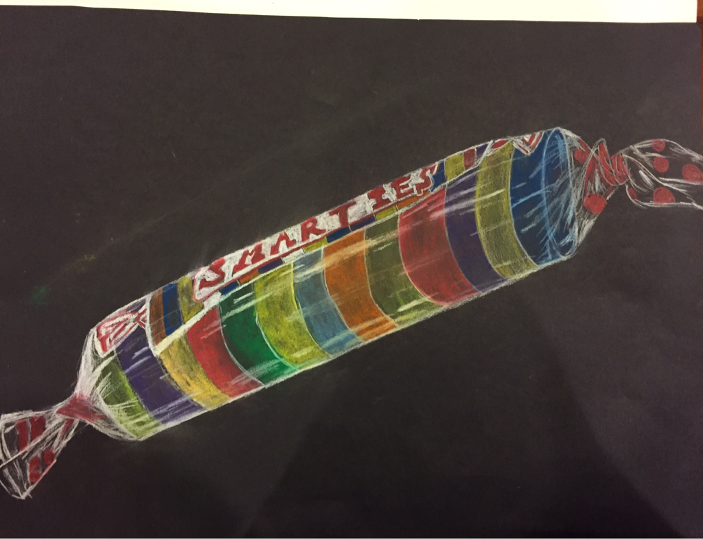 This is my pastel drawing of the smarties. I'm really happy with how it turned out!
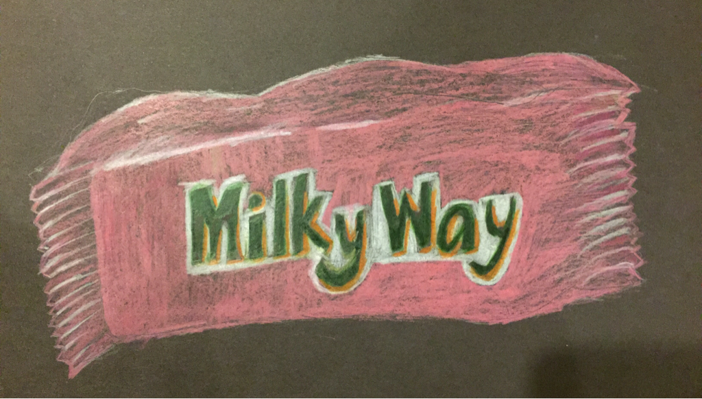 I still need to add more value. I like how the shape turned out. I also like how the lettering turned out. I decided to change the color to pink instead of brown.
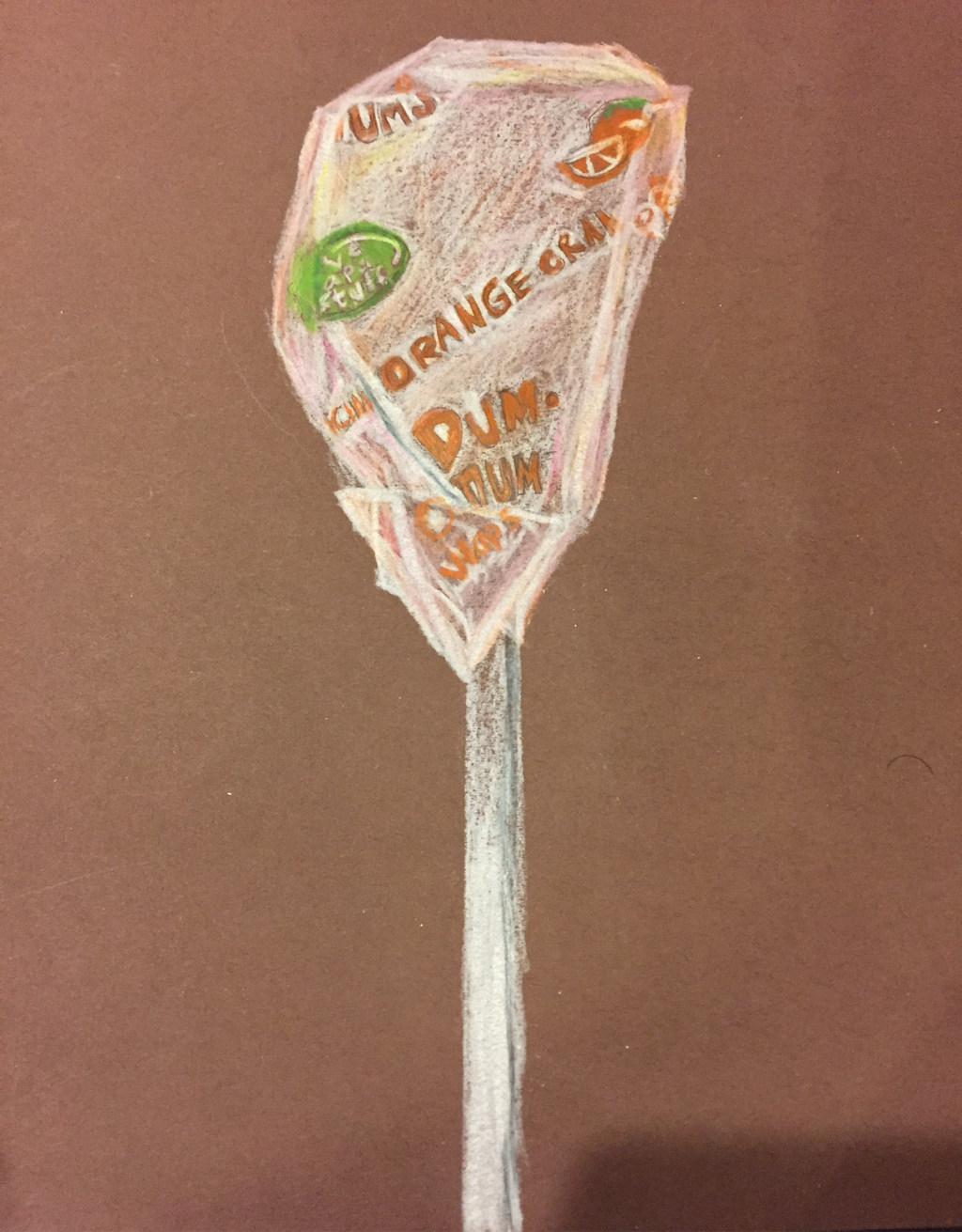 This was my prismacolor drawing for the DumDum lolipop. I had trouble with the proportions but I liked that I blended the white with some other colors (orange and pink). With the view I chose, it was also supposed to show a little bit of the back/top of the lollipop. I was a little disappointed with how the shape turned out. I think if I were to redo this project, I would choose a different perspective to make the lollipop rounder.
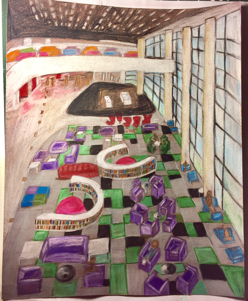 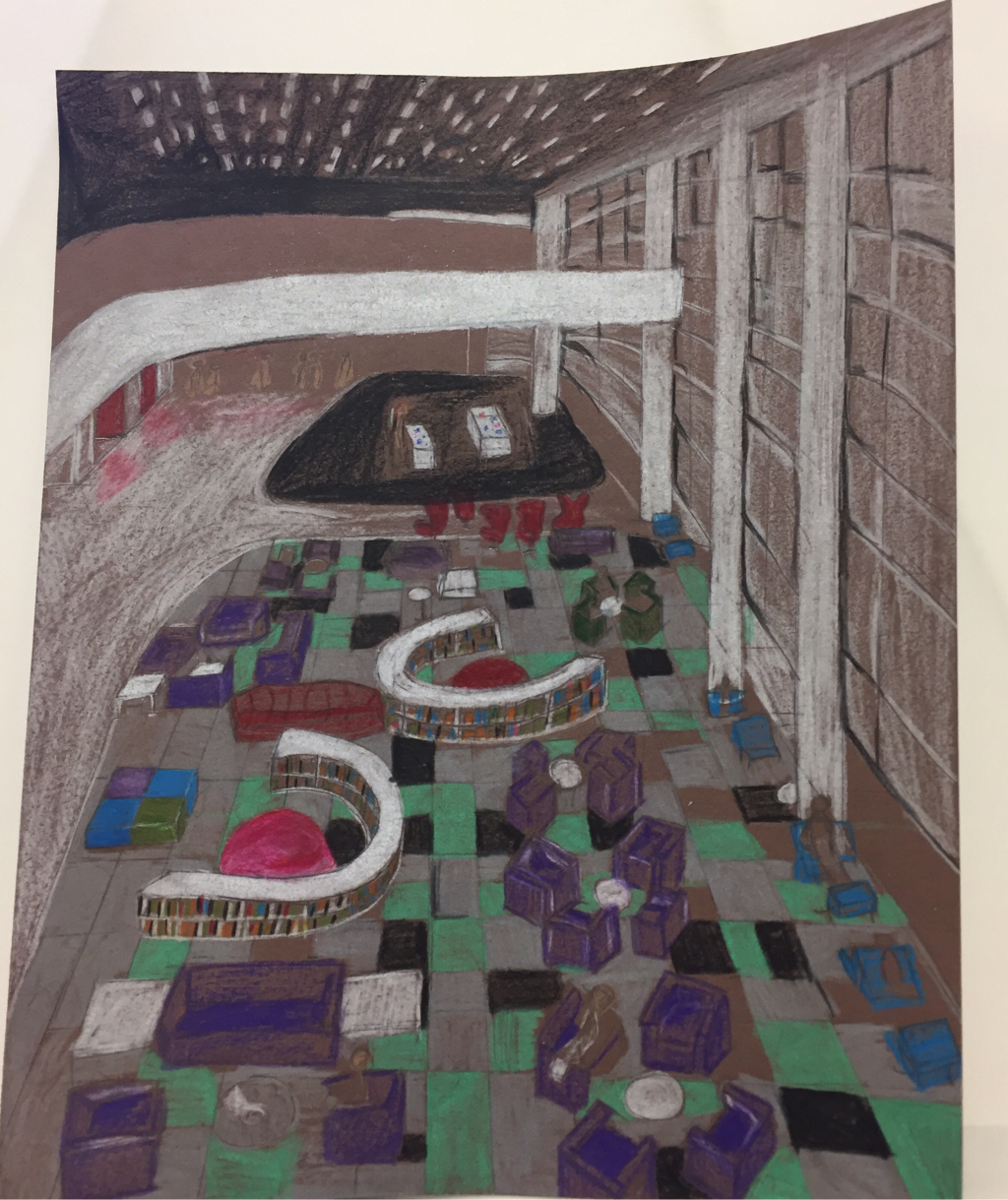 The top image is my final drawing for the look at that view project. I am pretty satisfied with how it turned out, I had to pay attention to a lot of small details. The bottom picture is in progress and you can see I had not added highlights yet.
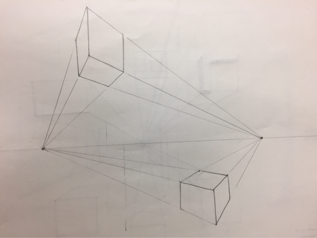 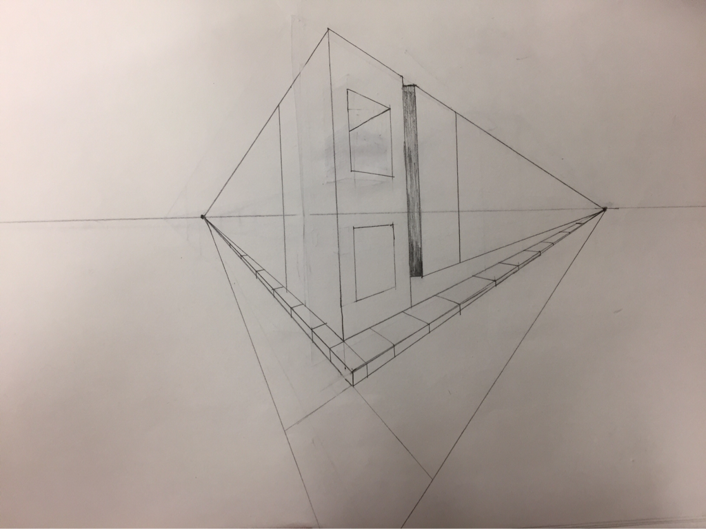 These are my 2 point perspective practices. I found them to be a bit harder than 1 point. I wish we had gotten to practice drawing other objects (not just street view). I liked how it turned out though.
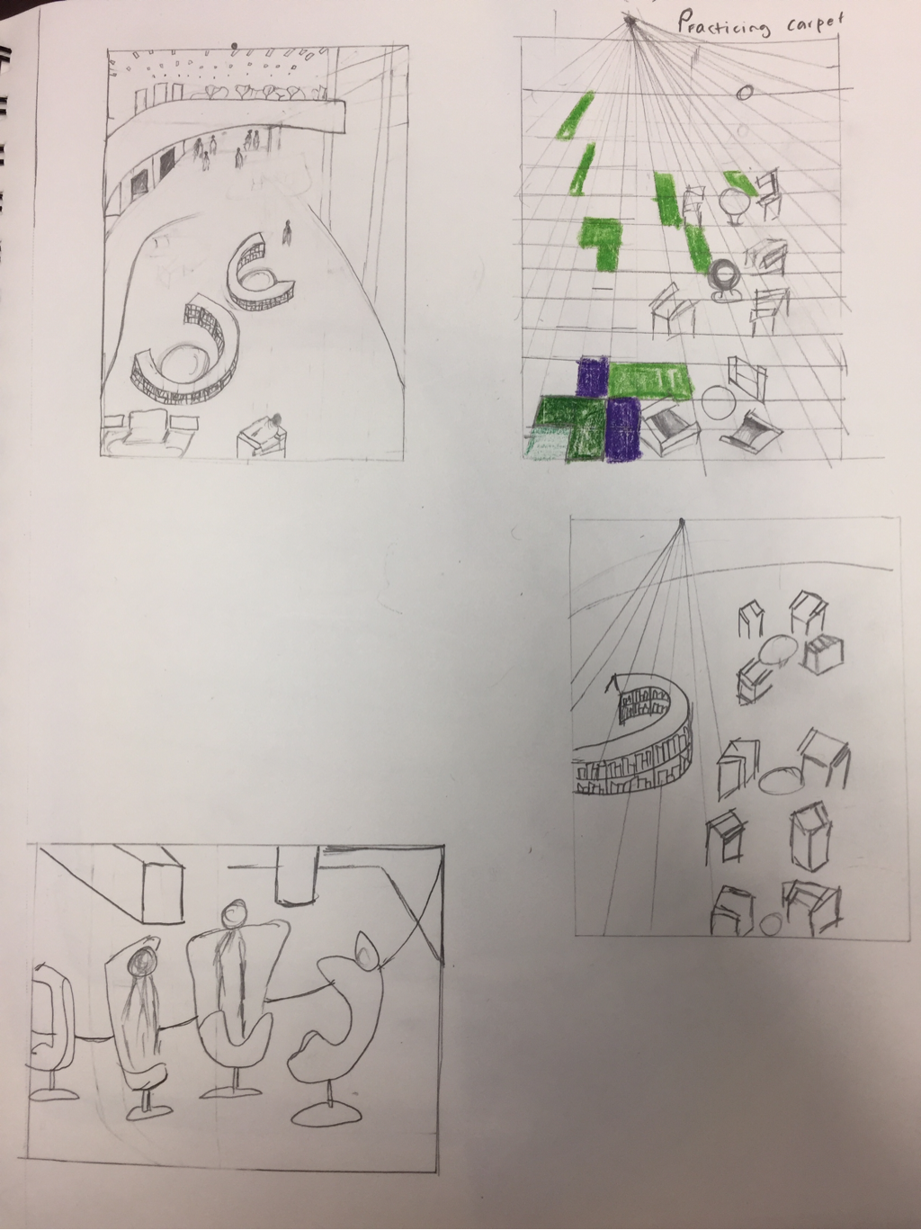 These are my practice sketches. I did 4 because I already knew I was going to do the top left one. It was hard in the beginning because I had trouble getting my proportions right so that it would look like the objects in the back are in the background and the objects in the front are in the foreground. The second one, I tried to practice drawing the carpet. It was challenging because the furniture has to look like it's on top of the carpet
|
TanviArchivesCategories |
 RSS Feed
